
Did you know the average user decides whether to stay on a web page within 50 milliseconds? In that razor-thin window, the layout of your page – specifically how it guides the eye – is one of the most powerful tools in your design arsenal.
Two of the most researched and applied visual hierarchy frameworks in web design are the Z-Pattern and the F-Pattern. Both are rooted in how human eyes naturally scan content, but each serves very different purposes. Choosing the wrong one can mean the difference between a visitor who converts and one who bounces.
In this guide, you’ll learn exactly what each pattern is, the science behind it, when to use each one, and how to apply both patterns effectively in real-world web design projects.
What Are Reading Patterns in Web Design?
Reading patterns in web design describe the predictable paths that users’ eyes follow when scanning a web page. These patterns emerged from eye-tracking research, studies that literally track where users look on a screen and for how long.
Understanding reading patterns allows designers to strategically place the most important content – headlines, CTAs, key images, and value propositions – exactly where user’s eyes are most likely to land.
The two dominant patterns identified by UX researchers are:
- The Z-Pattern: Dominant for pages with minimal text and strong visuals
- The F-Pattern: Dominant for text-heavy pages and content-rich layouts
Both patterns are based on the same underlying human behaviour: we read in the direction of our language (left-to-right in English), we gravitate to visual anchors, and our attention diminishes as we move down a page.
What Is the Z-Pattern Layout?
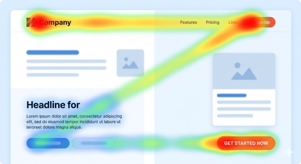
The Z-Pattern describes the path a user’s eyes follow when there is no dominant text block to guide them. The eye moves horizontally across the top of the page (the top bar of the ‘Z’), then diagonally down and to the left (the slash of the ‘Z’), and finally sweeps horizontally across the bottom (the base of the ‘Z’).
The Science Behind the Z-Pattern
This pattern was first formally described in research on print advertising and later validated for digital interfaces. It appears most strongly when a page has:
- A low volume of text content
- Strong imagery or white space
- Clear visual separation between sections
The Z-Pattern leverages the user’s instinct to start at the top-left (where logos and branding typically sit), scan across to the top-right (navigation or supporting actions), follow the diagonal to the next focal point, and complete at the bottom with a call to action.
Z-Pattern: Key Hotspots:
- Point 1: Top-left
- Point 2: Top-right
- Point 3: Bottom-left (diagonal landing point)
- Point 4: Bottom-right (primary CTA destination)
What Is the F-Pattern Layout?
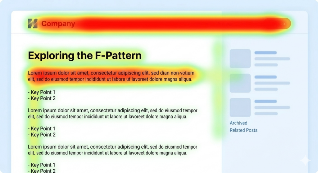
The F-Pattern was first documented by the Nielsen Norman Group in a landmark 2006 eye-tracking study of web users reading text-heavy pages. The pattern shows that users read in a shape that resembles the letter ‘F’:
- First, a full horizontal scan across the top of the content (the top bar of the ‘F’)
- Second, a shorter horizontal scan slightly lower (the middle bar of the ‘F’)
- Finally, the eye drops down the left side of the page in a vertical scan
The critical insight here is that content to the right and further down the page receives significantly less attention. Users are front-loading their reading, placing the most cognitive weight on beginnings of lines and the top of the page.
The Science Behind the F-Pattern
Research by the Nielsen Norman Group analysed the eye-tracking heatmaps of over 200 users reading web content. Their findings revealed that the F-Pattern is a response to information overload: when faced with dense text, users skim to find relevance fast, rather than reading linearly.
The pattern is especially pronounced when:
- Users are in ‘research mode’ rather than ‘consuming mode’
- The content lacks strong subheadings or visual breaks
- Trust has not yet been established — users scan before committing to read
Z-Pattern vs F-Pattern: Side-by-Side Comparison
Here is a concise breakdown of how the two patterns differ across the most important design considerations:
| Z-Pattern | F-Pattern | |
| Best for | Landing pages, homepages, ads | Blog posts, articles, search results |
| Content density | Low – minimal text, strong visuals | High – text-rich, detailed content |
| User intent | Browsing / quick decision-making | Research / information gathering |
| CTA placement | Bottom-right (end of Z path) | Top and left-aligned, above the fold |
| Image role | Central – drives the diagonal path | Supportive – breaks up text blocks |
| Skimming speed | Faster – pattern is intuitive | Moderate – requires content hooks |
| Key risk | Too sparse can feel empty | Losing users to right-side blindness |
| Common pages | SaaS landing pages, hero sections | News sites, docs, list articles |
When to Use the Z-Pattern
The Z-Pattern is your go-to design framework when you want a visitor to take a single, specific action with minimal friction. It excels in environments where the goal is conversion, not education.
Ideal use cases for the Z-Pattern:
- Landing pages with a single CTA – free trial sign-ups, app downloads, webinar registrations
- Hero sections on homepages where you have one key message and one desired action
- Paid ad landing pages where traffic is pre-qualified and decision-making is fast
- Above-the-fold sections of any page – before the user scrolls
- Email layouts and digital ads with brief, punchy copy
Pro Tip
If your page has a logo, a navigation bar, a central hero image, and a CTA – you already have the raw ingredients of a Z-Pattern. The key is alignment: make sure those four elements fall precisely along the Z path.
When to Use the F-Pattern
The F-Pattern is the right choice when your content is the product. If visitors come to your page to read, learn, or compare — not just to click a button, the F-Pattern gives you a framework for keeping them engaged.
Ideal use cases for the F-Pattern:
- Blog posts and long-form articles like this one
- Documentation, FAQs, and support pages
- E-commerce category pages and product listing pages (PLPs)
- Search engine results pages (SERPs) – Google itself follows this layout
- News and editorial websites
Pro Tip
Don’t fight the F-Pattern on text-heavy pages, work with it. Put your most important information at the beginning of each paragraph. Lead sentences are prime real estate. Front-load value and use bold text, subheadings, and bullet points to catch the eye during the vertical scan.
How to Apply Each Pattern in Practice
Applying the Z-Pattern
Follow these practical steps to implement the Z-Pattern on a landing page or hero section:
- Place your logo or brand name in the top-left corner – this is where every visitor’s eye begins
- Use the top-right corner for a secondary action (e.g., ‘Log In’, ‘Contact Us’, or social proof like ‘10,000+ users’)
- Use the diagonal zone for a hero image or illustration that carries emotional weight – this is what holds the eye as it moves
- Position your headline and primary CTA button at the bottom of the Z – bottom-centre or bottom-right
- Keep the design uncluttered – excessive elements break the natural path
Applying the F-Pattern
Designing for the F-Pattern means designing for skimmers first, readers second:
- Place the most critical information in the first two paragraphs – assume many users won’t read below the fold
- Use descriptive subheadings (H2s and H3s) that are informative on their own – skimmers will read only these
- Bold key terms and phrases within paragraphs – they catch the eye during the vertical scan
- Left-align all key content – avoid putting anything critical on the far right of text blocks
- Use bullet points and numbered lists to break up walls of text and give the eye natural stopping points
- Include visual elements (images, pull quotes, callout boxes) to reset attention and pull the eye back to the left
Common Mistakes to Avoid
Z-Pattern Mistakes
- Placing the CTA at the top — this disrupts the path before trust is established
- Adding too many elements that fragment the diagonal visual flow
- Using the Z-Pattern on content-heavy pages — it creates confusion without clear visual breaks
F-Pattern Mistakes
- Burying key information in the right half of paragraphs — it will largely be ignored
- Writing long, unbroken paragraphs — they accelerate skimming and reduce comprehension
- Neglecting the first sentence of every section — if it’s weak, many users abandon the entire section
- Assuming all users read linearly — design for the scanner, reward the reader
Conclusion
The Z-Pattern and F-Pattern are not competing frameworks – they are complementary tools that serve different design contexts. Skilled web designers know how to move between them depending on the page type, user intent, and content density at hand.
To summarise the core principles:
- Use the Z-Pattern when your goal is conversion: minimal content, maximum visual impact, one clear action
- Use the F-Pattern when your goal is comprehension: rich content, structured hierarchy, front-loaded value
- In both cases, content placement relative to the reading pattern determines whether your most important messages land – or get skipped entirely
- Eye-tracking research is your friend: validate design decisions with real user data whenever possible